ViaLynk - Consumer EV Charging App
Redesigning the map experience for 20,000+ EV drivers to find available charging stations quickly and confidently


Project overview


What drivers told us
Research conducted
We conducted in-person interviews with EV drivers at a mall location where ViaLynk chargers were installed, as well as with colleagues who regularly used the chargers. Several participants had used the app before and described frustration with locating stations, understanding availability, and relying on repeated zooming to find usable chargers.
Key Insight:
Drivers primarily cared about availability first, not proximity
Users wanted to know if a charger was usable before navigating
Repeated zooming felt slow and stressful especially when low on charge
Discovering unavailability late caused frustration
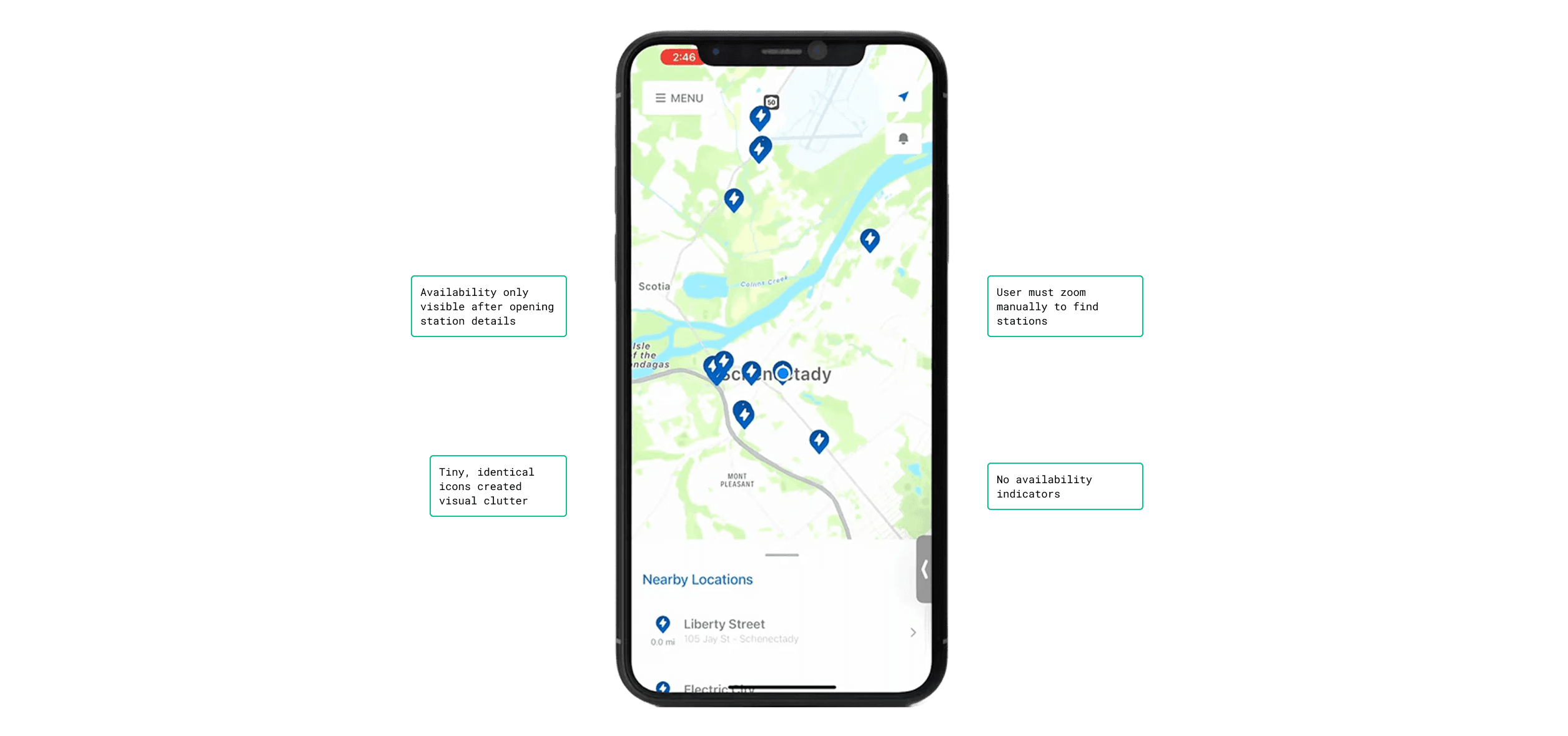
Why the previous design failed
The original map treated all stations equally and gave drivers no way to assess availability at a glance. As a station density increased, the map became harder to use by forcing users into slow, manual exploration.
Design Goal
Enable drivers to quickly identify available chargers nearby with minimal zooming, clear visual signals, and predictable interactions.
Key Design Decisions & Tradeoffs
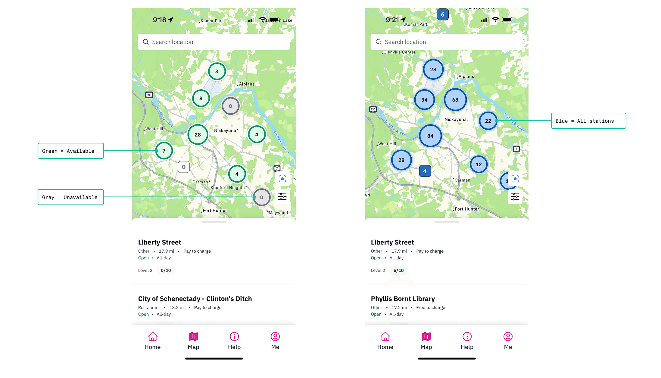
Decision 1: Introduced color-coded availability
What changed
Green pins represent available chargers
Gray pins represented unavailable chargers
Blue pins represent all chargers
Tradeoff
The pins prioritize availability over showing multiple attributes at once, deferring other details to filters and station views.
Why
Drivers needed to understand availability instantly, before interacting with the map.
Decision 2: Implemented clustering to manage density
What changed
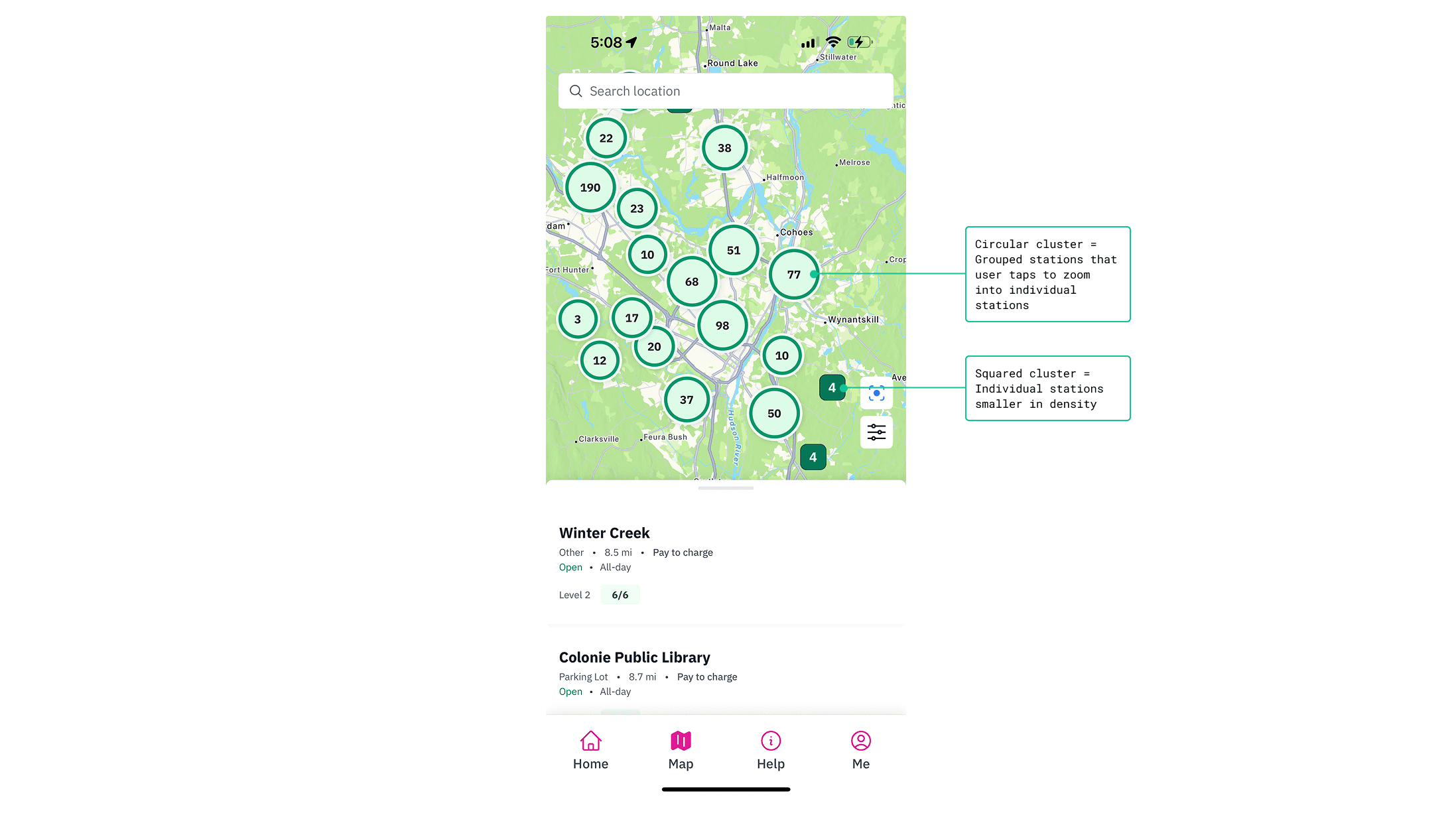
Stations group into clusters based on density
Circular clusters represent grouped stations at more than one location
Square clusters indicate the number of individual stations at a location
Tradeoff
Individual stations are hidden at higher zoom levels to keep the map readable.
Why
Showing every station at once made the map overwhelming and slowed decision-making.
Decision 3: Enabled progressive zoom through interaction
What changed
Tapping a cluster automatically zooms into individual stations.
Tradeoff
Less manual zoom control in exchange for faster access to detail.
Why
Drivers wanted speed over precision when scanning for availability.
Decision 4: Added filters and search bar
What changed
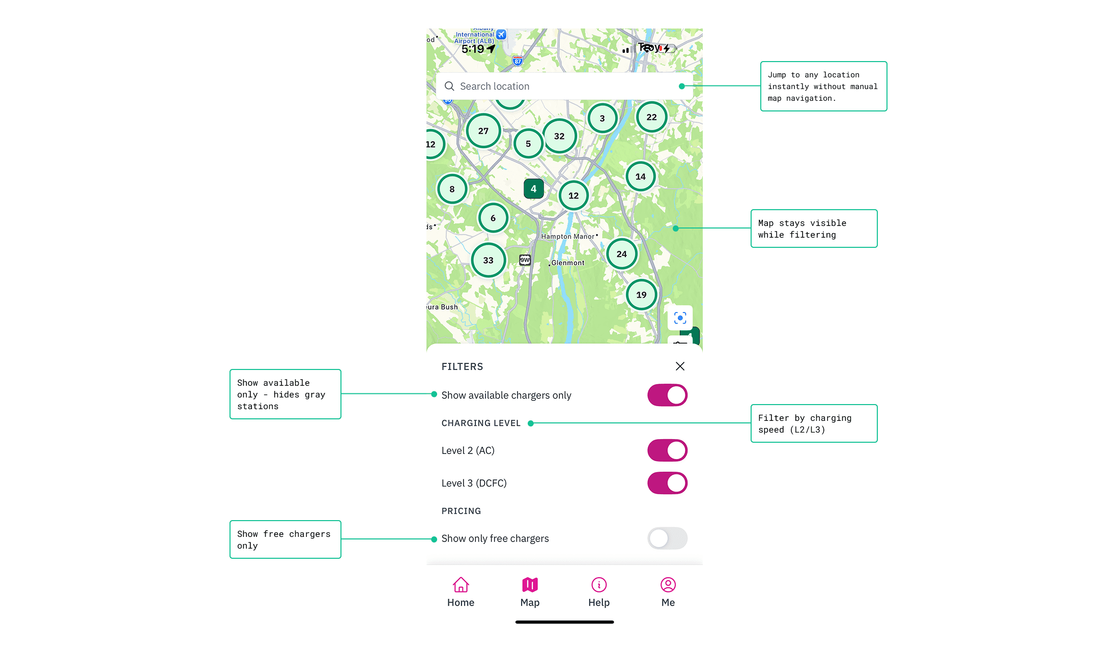
Added a search bar for direct location lookup
Added filters for available chargers, charging station levels, and free chargers
Tradeoff
Additional UI controls increased visual density on the map.
Why
Drivers wanted faster ways to narrow options without repeated zooming or trial-and-error.
The Before/After Experience

The redesigned flow eliminates exploratory zooming and reduces availability checks to a single step.
Validation
The redesigned map addressed the primary frustrations surfaced during in-person interviews. Drivers were able to identify available chargers faster and with fewer interactions, reducing unnecessary navigation and uncertainty.
Key Quote:
"This would've saved me so much stress last week when I was almost out of battery. I can actually see which stations are open without clicking on every single one." - Frequent ViaLynk User
Results & Impact
Time to find charger: 2-3 min → 20-30 sec
Filter adoption: 65%+ of map sessions
Support tickets dropped significantly
Taps reduced: 8-12 → 2-3
What this taught me
Availability is the primary decision signal in EV charging, not proximity alone
Map interfaces fail quickly without hierarchy and visual rules
Designing zoom. clustering, and filtering together is more effective than treating them as separate features
Reflection
If I revisited this work, I'd test edge cases like extremely dense urban areas earlier to further refine clustering thresholds.
