K&A Pharmacy Group - Website, Intake Flow, Print Collateral
Responsive website and print collateral for a Bronx pharmacy, clarifying patient and provider paths while connecting local outreach to a digital intake flow.


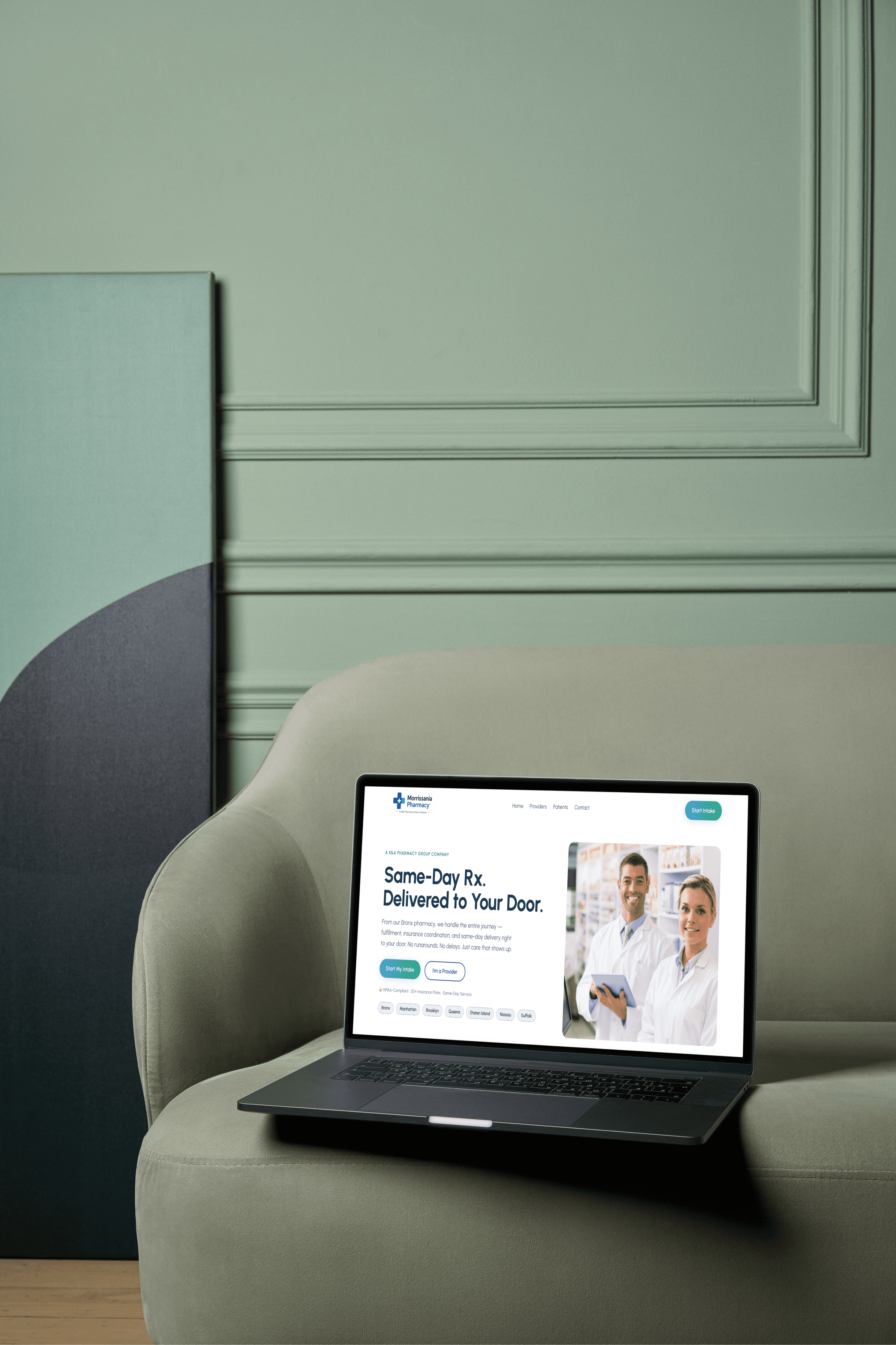
Project overview
The challenge
K&A Pharmacy Group needed more than a polished website. The pharmacy offered same-day prescription delivery, insurance coordination, prior authorization support, provider referrals, and direct patient care — but those services needed to be organized into a clear experience for two different audiences.
Patients needed to quickly understand how to get medication delivered, what support the pharmacy provided, and how to start intake. Providers needed to understand whether the pharmacy could reliably support referrals, insurance coordination, prior authorizations, and patient communication.


Strategy
I structured the experience around the pharmacy’s two main audiences: patients and providers.
Instead of treating the site like a generic local pharmacy page, I organized the content around user intent.
Patients needed:
Fast reassurance, service clarity, delivery information, insurance support, and a clear way to start intake.
Providers needed:
Operational trust, referral clarity, support details, and confidence that their patients would be handled properly.
Offline users needed:
A simple way to move from a flyer or business card into the digital intake path.
This created the foundation for the website and print system: one clear service promise, multiple entry points, and consistent messaging across web and physical materials.
Key decision 1: Separate patient and provider pathways
The pharmacy served both individual patients and healthcare providers, but both audiences had different questions.
A patient might ask:
“Can this pharmacy help me get my prescription delivered quickly?”
A provider might ask:
“Can this pharmacy support my patients and handle the pharmacy-side workflow reliably?”
To reduce confusion, I created separate patient and provider paths across the site. The navigation, homepage CTAs, and page structure help visitors self-select based on what they need.
This made the experience easier to scan and prevented the website from becoming one long generic service page.
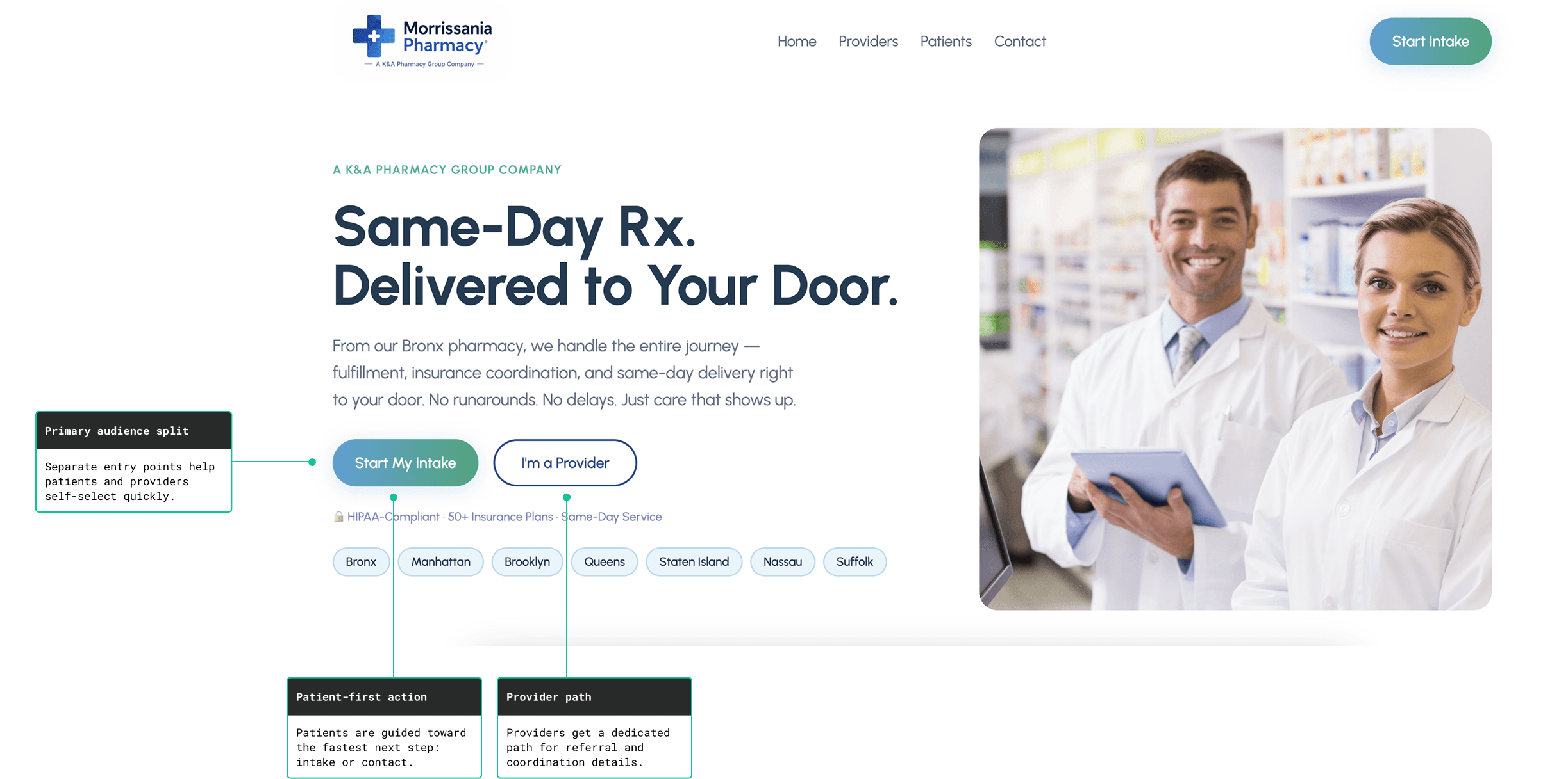
The homepage needed to route two different audiences without making the experience feel complicated.
Key decision 2: Make the core promise obvious
The pharmacy’s strongest value was not just that it offered “pharmacy services.” The clearer promise was:
Same-day Rx delivery with insurance coordination and direct support.
I used that message as the center of the experience. The website and flyer both lead with the same practical benefit: medication delivered to the patient’s door, with the pharmacy helping manage the behind-the-scenes process.
This helped simplify a service model that could otherwise feel complicated.
Instead of making users read through every operational detail first, the site quickly answers:
What does the pharmacy do?
Who is it for?
What help do they provide?
What is the next step?
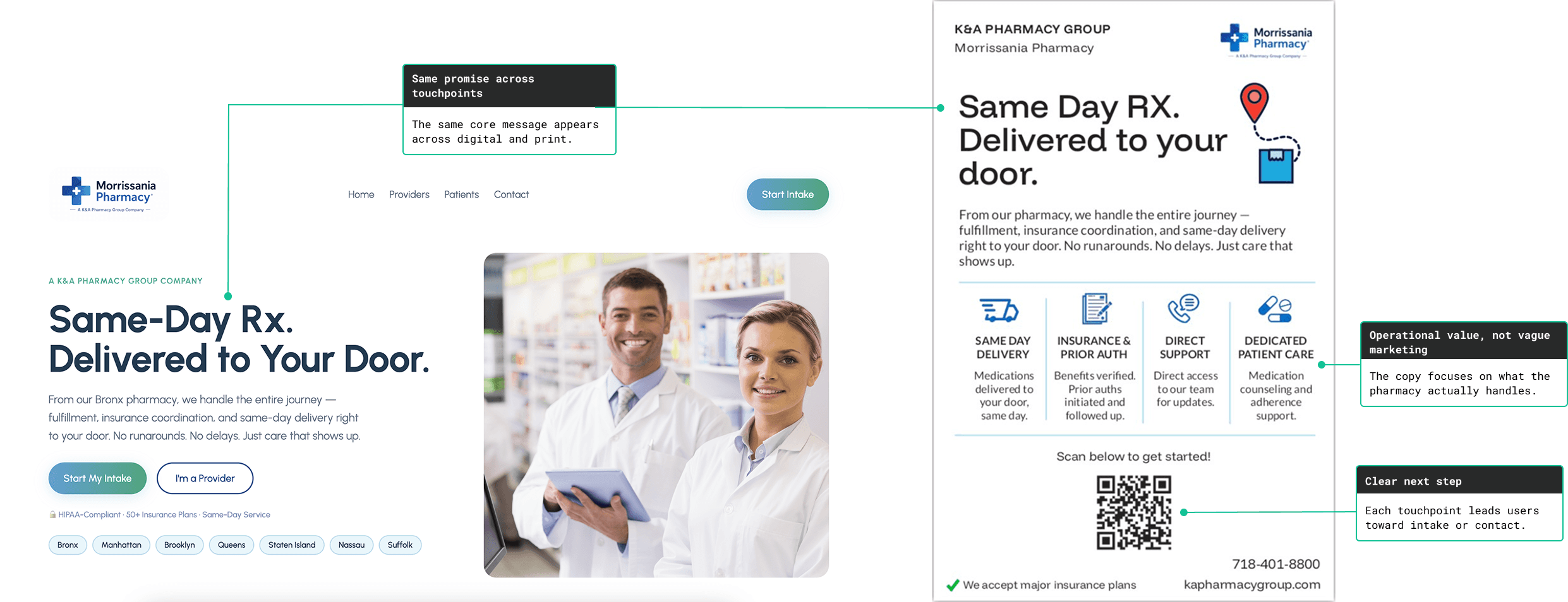
I kept the message consistent across the website and print materials so patients could understand the service no matter where they first encountered the pharmacy.
Key decision 3: Build trust before asking users to act
In healthcare-adjacent services, users need trust before they take action. A “Start Intake” button alone is not enough if the site does not first feel credible and operational.
I supported the intake path with trust signals throughout the experience:
service coverage
insurance support
HIPAA-conscious messaging
same-day delivery promise
direct phone and email access
physical pharmacy address
FAQs
testimonials and service details
The goal was to make the pharmacy feel reachable, legitimate, and useful before asking patients or providers to move forward.
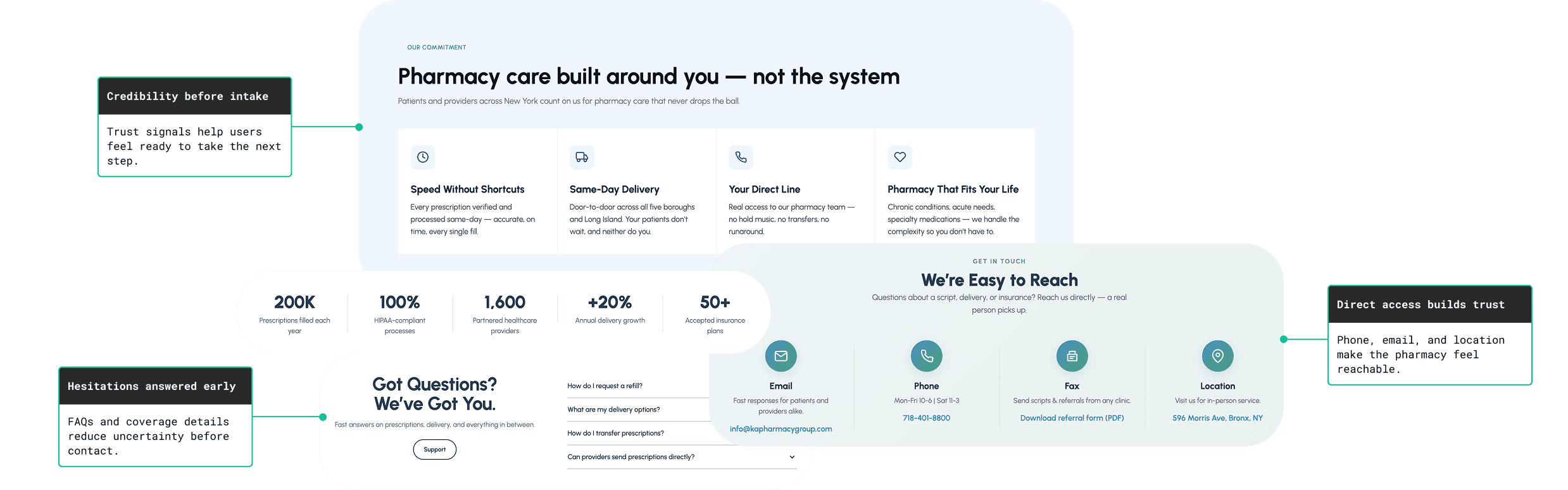
The goal was to make the pharmacy feel legitimate, reachable, and clear before asking users to take action.
Key decision 4: Connect print materials to the intake flow
The pharmacy also needed materials for real-world outreach. Flyers and business cards had to do more than look branded — they needed to help people take action.
I created print collateral that carried the same message from the website into physical touchpoints.
The flyer highlights:
same-day delivery
insurance and prior authorization support
direct support
dedicated patient care
The business card includes contact details and a QR code so patients or providers can move from offline interest into the intake flow.
This helped connect the pharmacy’s physical outreach with the digital experience.
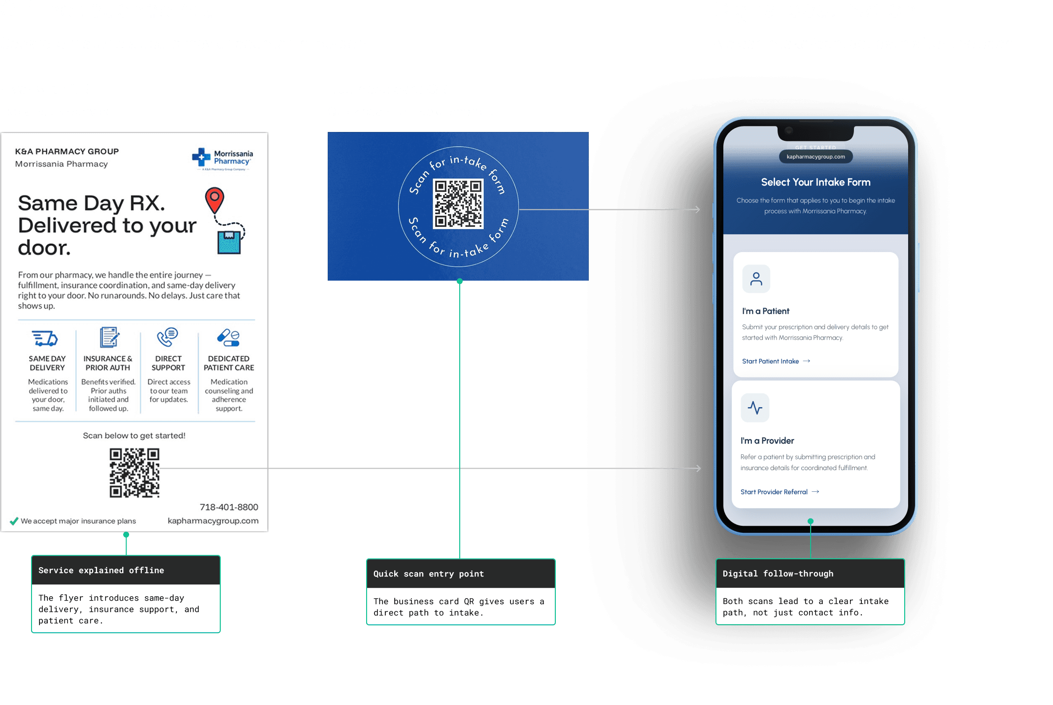
The print system connected offline interest to a clear digital intake path.
Final solution
The final solution gave K&A Pharmacy Group a clearer and more consistent service presence across web and print.
What shipped:
Responsive website
Patient and provider pathways
Intake entry points throughout the site
Flyer for outreach
Business card front and back
QR-based handoff into the intake flow
The website acts as the digital front door. The print materials extend that same message into local outreach and referral conversations.
Outcome
This project launched as a live website and supporting collateral system for a real pharmacy business.
The work helped organize K&A Pharmacy Group’s service offering into a clearer experience for patients and providers. Instead of presenting the pharmacy as a general service provider, the site now gives visitors a direct path based on their intent.
Because analytics tracking was not part of the initial scope, I am not claiming conversion lift. The next step would be measuring how well users move from the website and print materials into intake, calls, and provider inquiries.
Validation plan
Since analytics were not part of the initial scope, I’d validate whether users reach the right next step after launch.
What I'd measure:
Intake actions
Start Intake clicks, form starts, completed submissions
Offline → online
QR scans from flyers/cards and QR-to-intake starts
Contact / referral intent
Click-to-call, provider inquiries, contact form activity
Main success signal:
Users reach intake or contact without needing extra explanation from the pharmacy team.
Reflection
This project reinforced that service-business websites need more than visual polish. They need clear audience paths, trust-building content, and practical conversion points.
The most important design decision was separating the experience by user intent. Patients and providers were not looking for the same information, so the site needed to guide each group without making the navigation feel complicated.
If I were improving this project in a second iteration, I would add stronger analytics tracking, QR-specific campaign tracking, clearer intake fallback states, and more structured post-launch testing around patient and provider conversion paths.
The biggest takeaway: a good service website does not just explain what a business does. It reduces uncertainty at the exact moment someone is deciding whether to trust it.
