Chargelync - Internal Operations Platform
Reduced dispatch friction and improved decision speed for operators handling high-volume support requests.


Project overview


Why the system failed under real operational pressure
Through discussions with support teams and analysis of 12,000+ system logs, I identified three critical breakdowns:
No Historical Context
Operators could see current station status but had no visibility into connection patterns or recurring failures. It was impossible to distinguish one-off glitches from recurring failures.
Fragmented Information Architecture
Critical information like station details, support tickets, commands, and logs were scattered across different pages. Diagnosis required juggling tabs and relying on memory.
Log Noise Over Signal
OCPP logs contained the answers operators needed, but they were buried under hundreds of heartbeat messages with no meaningful filtering. These weren't usability bugs, they were decision-making failures.
Design Goal
Enable operators to answer one question quickly and confidently:
"Do I need to dispatch a technician, or can this be resolved remotely?"
This meant prioritizing interpretability over completeness, especially under time pressure.
Key Design Decisions & Tradeoffs
Decision 1: Consolidate diagnostics into a single station overview
Alternatives considered:
Keep separate pages and add cross-links
Create a customizable dashboard
Why I rejected them:
Cross-links preserved context switching
Custom dashboards added cognitive overhead and slowed onboarding
Final decision:
A single station overview page that surfaces all critical diagnostic signals at once, with deeper detail available through tabs.
Tradeoff:
Less flexibility for power users
Mitigation:
Advanced diagnostics moved to dedicated tabs rather than hidden behind customization
Decision 2: Surface patterns, not raw data, by default
Problem: Operators did not need any more data, they needed clarity.
Decision:
Show uptime trends and connection patterns instead of raw logs
Highlight anomalies first
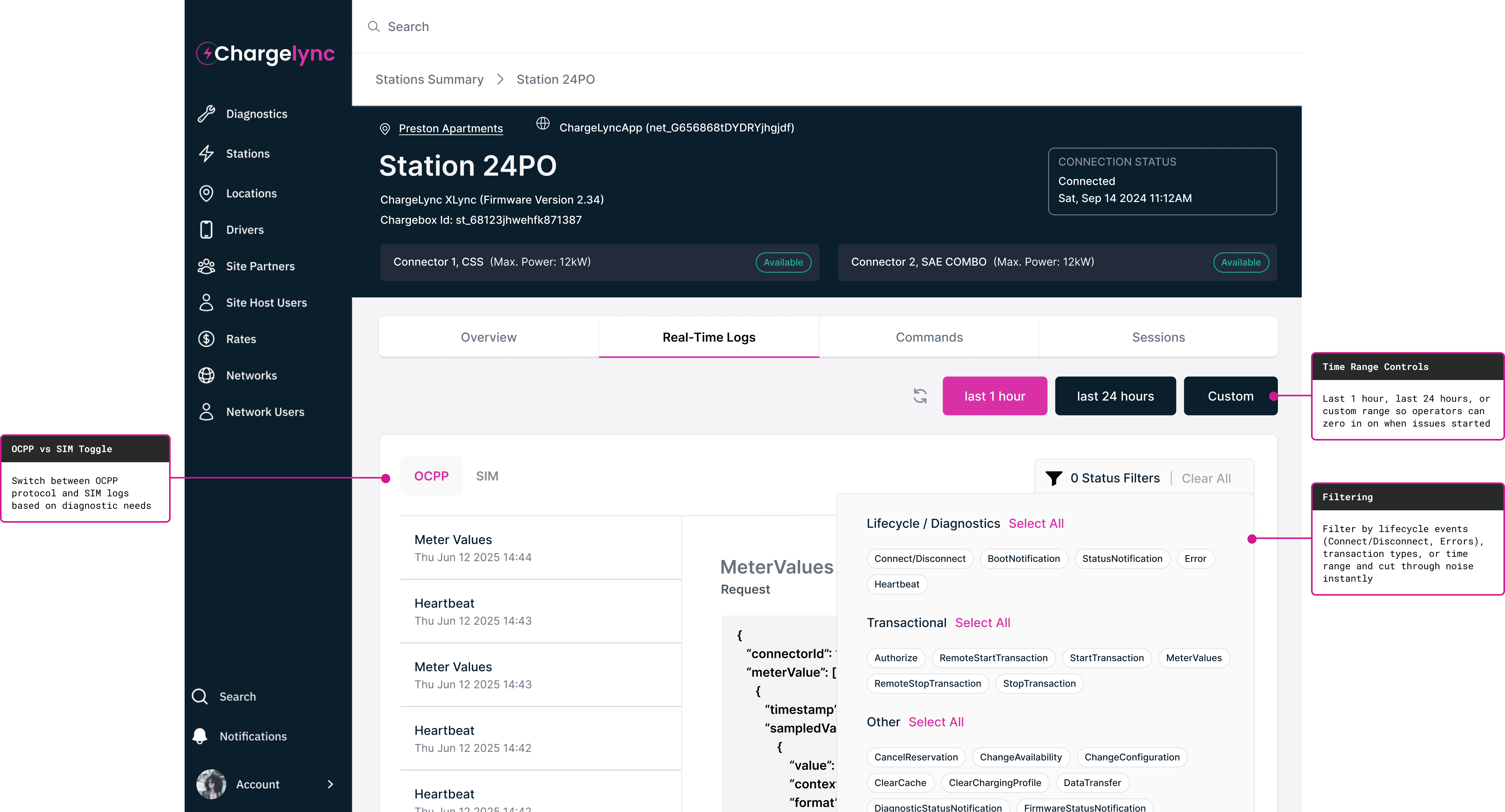
Hide heartbeat messages by default
Tradeoff:
Reduced transparency for edge- cases by default
Mitigation:
Full log access preserved through filters and drill-down views.
Decision 3: Integrate support tickets directly into diagnostics
Why this mattered:
Operators often dispatched technicians without realizing a station had unresolved or recurring issues.
Decision:
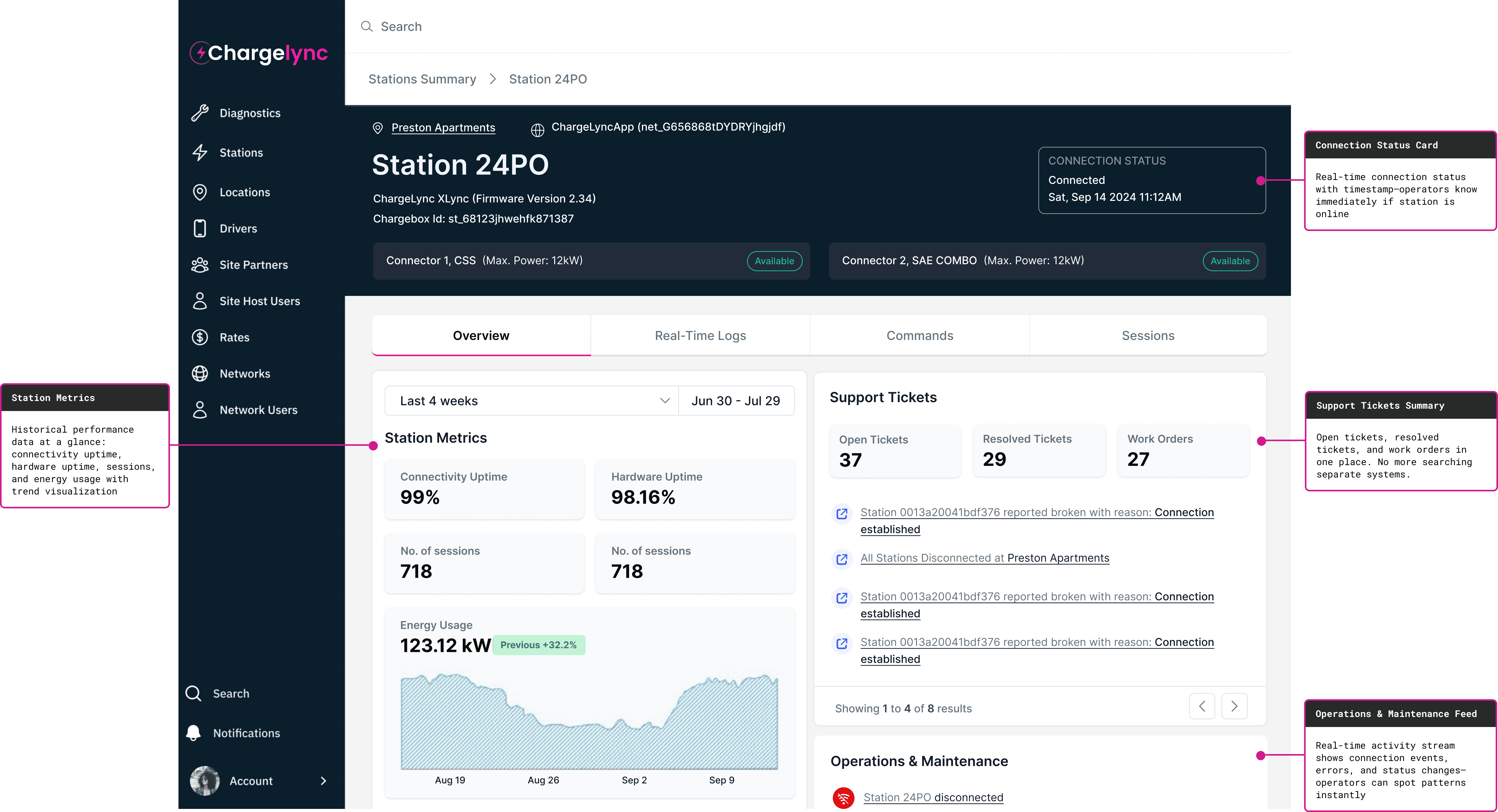
Embed a support ticket summary directly into the station overview:
Open tickets
Resolved tickets
Work orders
Impact:
Operators could immediately see if a problem was isolated or part of a pattern, changing dispatch decisions in real time.
The Solution
Consolidating diagnostics into a single decision surface
Everything needed for diagnosis is on one screen. Operators no longer assembled content manually, The system did it for them.
Turning raw protocol logs into actionable diagnostics
Reduced log scanning time from from minutes to seconds and restored trust in log data as a decision-making input.
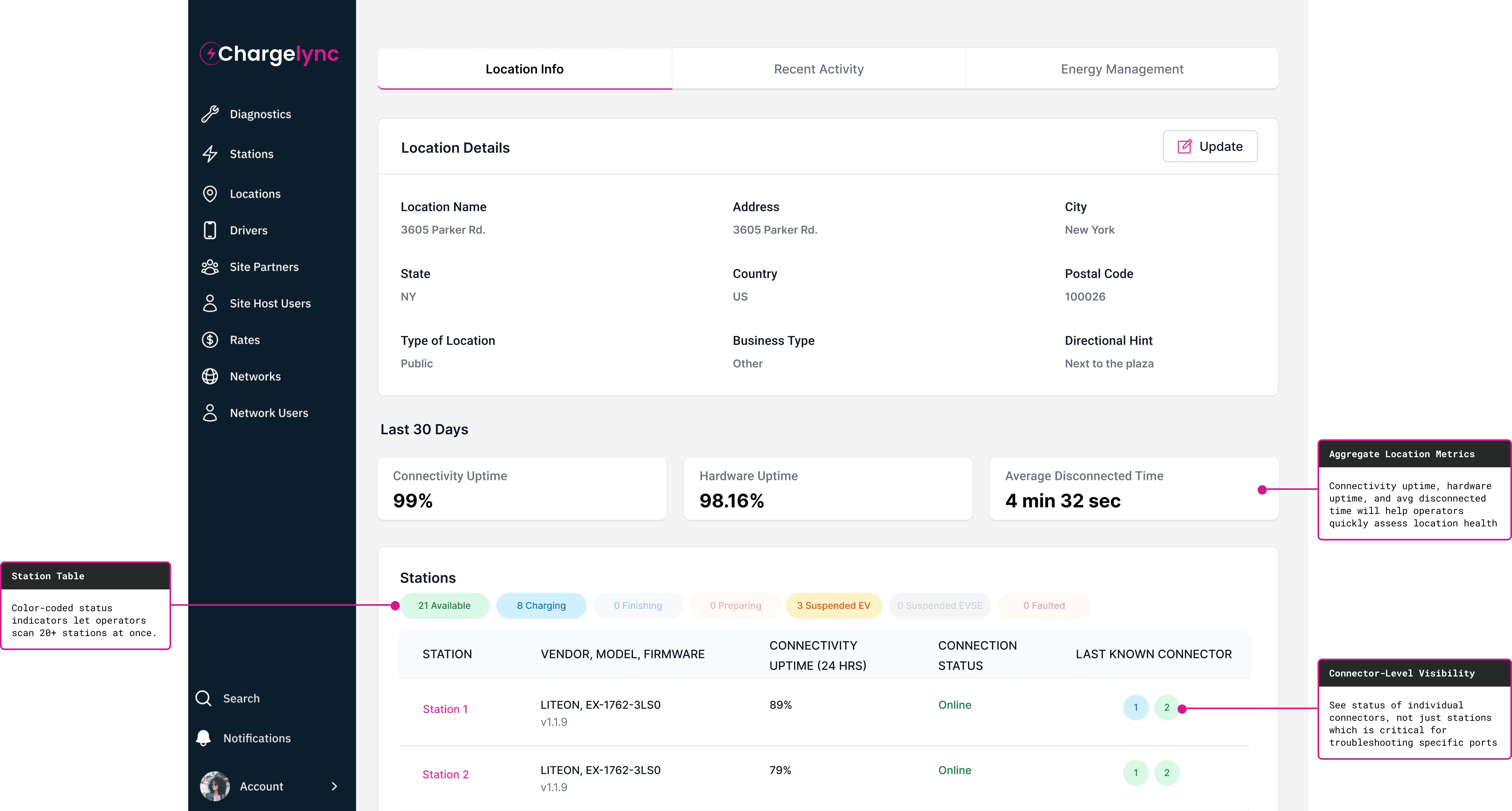
Scaling diagnosis from individual stations to system-wide health
Location page evolved from a static list into an operational dashboard. This allowed operators to identify systemic issues across locations rather than reacting station by station.
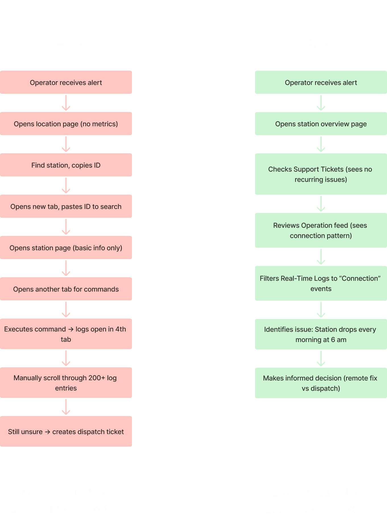
Workflow Comparison
The difference wasn't speed alone, it was certainty.
Validation
I tested prototypes with 5 operations team members using real incident scenarios.
Test Scenario:
"Station 24PO went offline yesterday. Determine if you need to dispatch a technician."
Old Interface
18 minutes average
Opened 4 - 5 tabs, manually searched logs,
40% dispatched unnecessarily
New Interface
7 minutes average
Checked tickets (no recurring issues ) —> filtered logs to connection events —> identified daily 6 am pattern
95% made correct decision
Key feedback
"Being able to filter to just errors or just connection events is a game-changer. I don't have to dig through heartbeats anymore." —Tech Support Member
Results
Within three months of launch:
Diagnosis time dropped 62%
Unnecessary dispatched reduced by 43%
Annual operational savings of $127K
Support confidence increased from 6.2/10 to 8.7/10
The biggest gains came from simplifying the UI, not expanding.
Learnings & Reflections
The highest impact design decisions weren't visual, they were about what to hide.
Operators didn't want flexibility, they wanted clarity under pressure.
The "obvious" solutions (tabs, filters, summaries) outperformed more complex alternatives once tested.
Involving field technicians earlier would have further refined dispatch criteria and filtering priorities.
This project reinforced that strong UX in operational tools is less about elegance and more about helping people make irreversible decisions with incomplete information.
