CarLane - Redesign for a Local Car Dealership
Redesigned CarLane’s shopping flow to help visitors browse inventory, compare vehicles, schedule test drives, and find financing without decision overload.


Project overview


Audit
The original CarLane interface was a conversion leak, not just a design failure. By auditing the site, I identified that users were being forced to navigate five competing primary actions simultaneously, leading to immediate choice paralysis. I identified that the inventory browsing did not support fast comparison, which is the primary friction point for automotive shoppers.
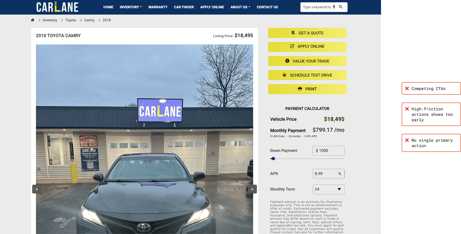
Audit callout: multiple equal-weight CTAs creates noise and indecision.
Strategy
I aligned the experience to the real dealership funnel:
Browse → Schedule a test drive → Finance (when ready)
To reduce decision fatigue, I set CTA rules across the site:
Home: Browse Inventory (primary), Schedule Test Drive (secondary), Financing in nav
Inventory: Browsing + View Details stays the focus; filters/sort support narrowing
VDP: Schedule Test Drive becomes the primary commitment action; financing is supportive, not the first push
The 3 decisions that drove the redesign
Decision 1 — One primary action per page (CTA hierarchy)
Before: Pages asked users to do five things at once.
After: Each page has one clear primary action, with supporting actions secondary.
Example - Hero page
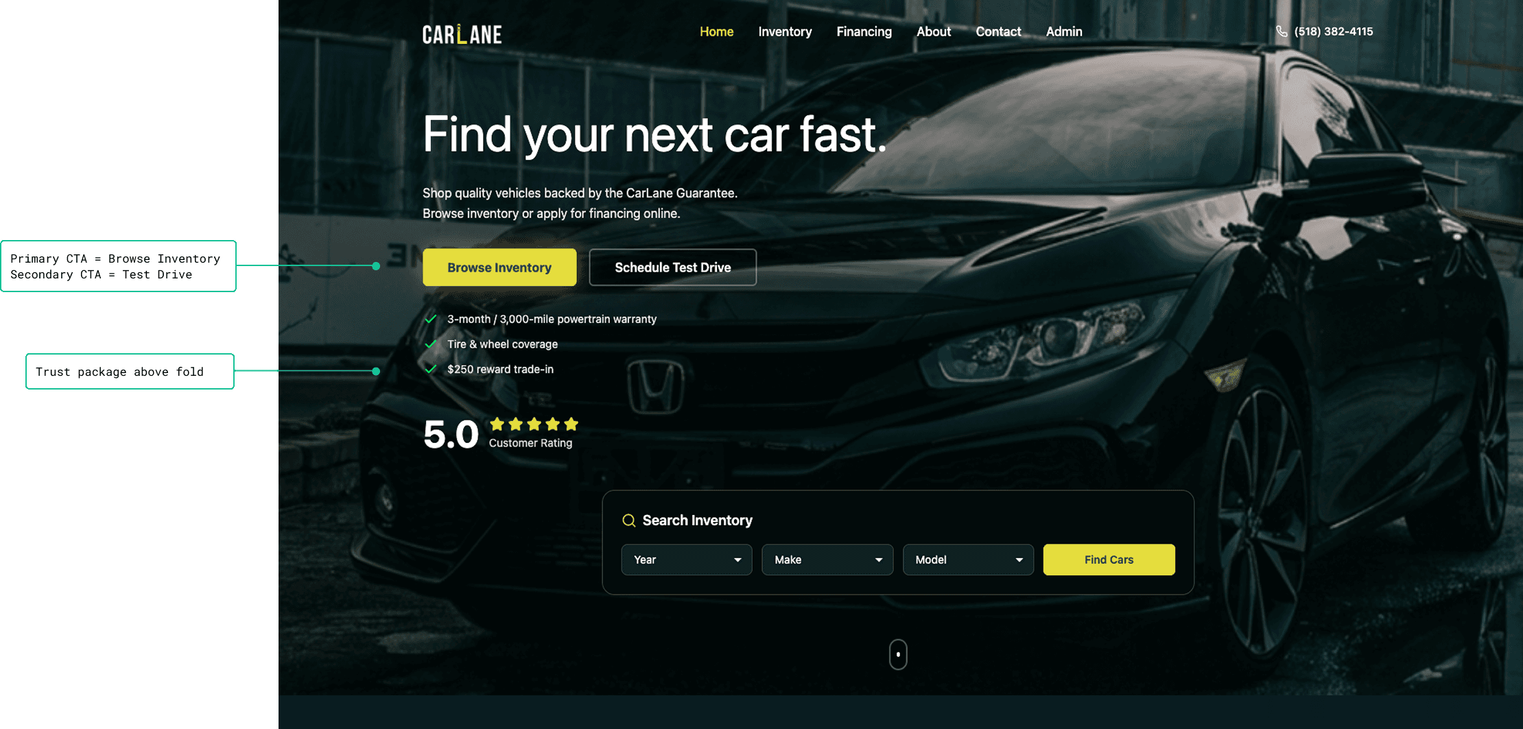
Home: Browse Inventory is primary; Test Drive is secondary; trust moved above the fold,
Decision 2 — Trust at the moment of hesitation
Before: Warranty/guarantee/ratings were present but not doing enough work.
After: Trust is positioned near the points where users hesitate (first impression + commitment moments).
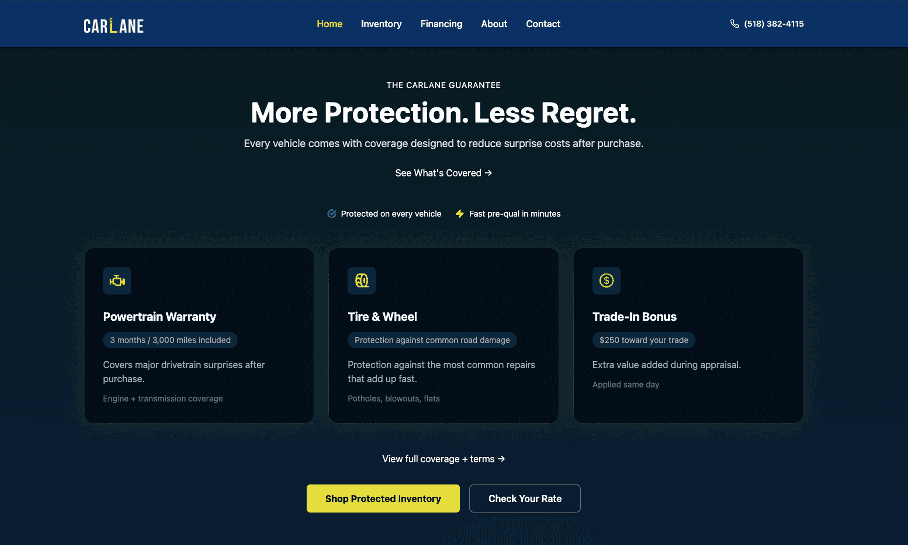
Trust: guarantee + coverage presented as a quick checklist (fast to scan).
Decision 3 — Faster browsing + easier comparison (Inventory + VDP)
Before: Inventory was harder to scan; Vehicle Details felt cluttered.
After: Inventory is scan-first, and the VDP focuses on a single decision moment.
Inventory
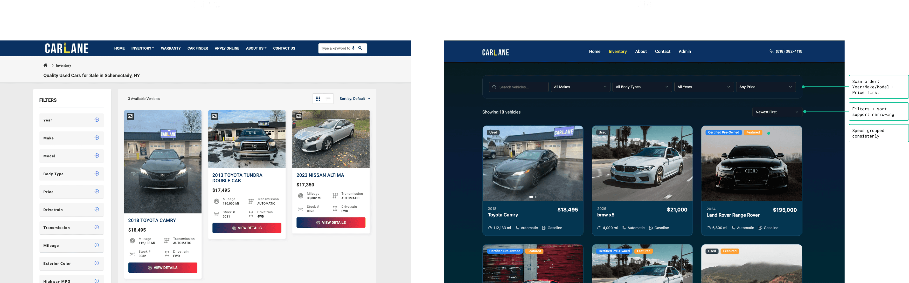
Inventory: scan order improved (model + price first), consistent specs, faster comparison.
Vehicle Details (VDP)
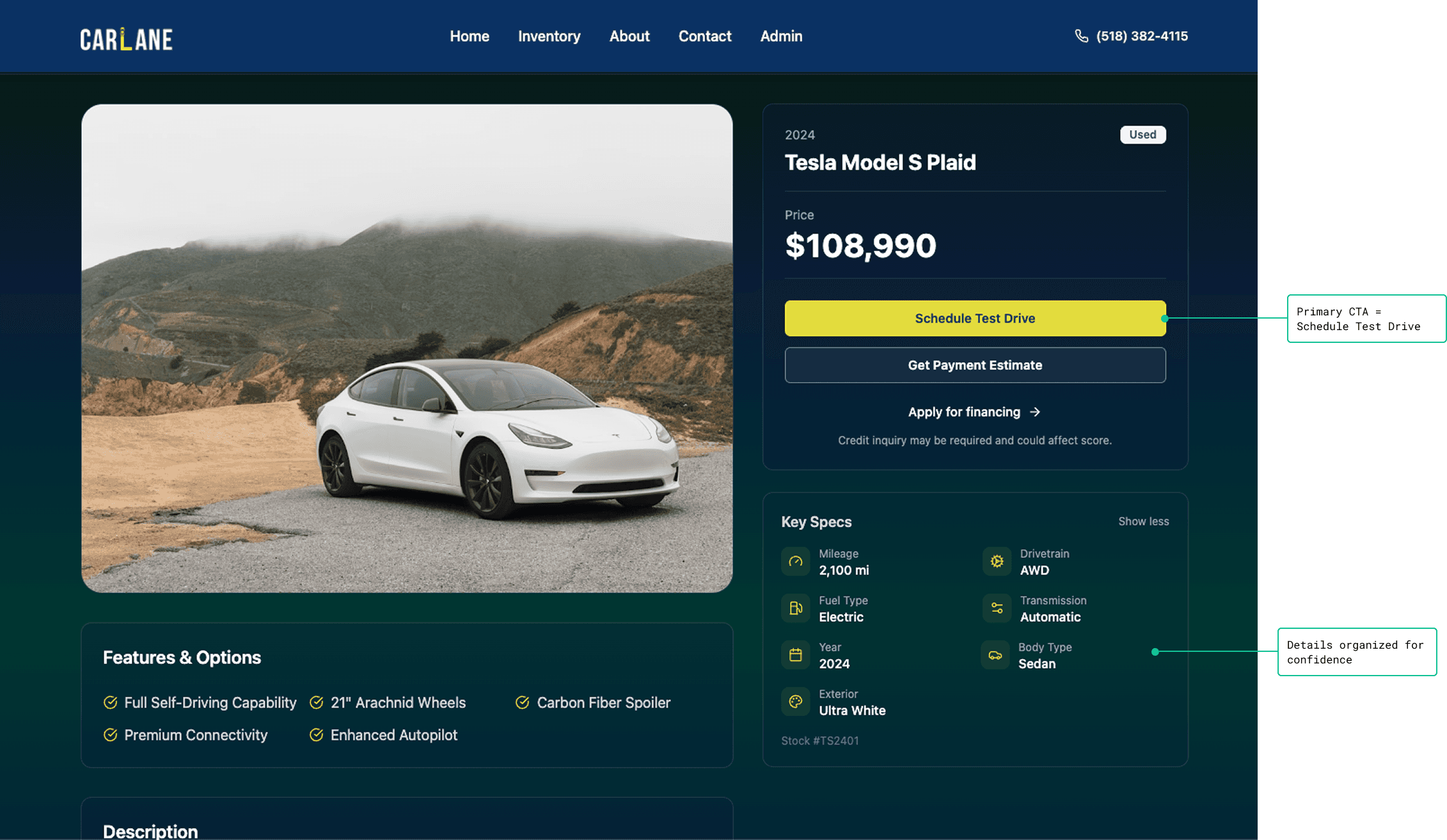
VDP: single moment of decision — Schedule Test Drive is primary; payment/financing supportive.
Technical Validation & The Build
I built a working demo in Base44 to validate that the design decisions were technically feasible, not just visually clean. This meant inventory filtering and financing flows were testable before any dev time was spent, reducing implementation risk.
To see how these architectural decisions translate into a real-world environment, you can interact with the live build here:
Explore the CarLane Published Site
Financing placement
I did not make financing the main homepage conversion because it’s a high-friction credit application. Most users need inventory context first.
What I did instead:
Kept Browse Inventory as the main path
Promoted Schedule Test Drive as the first meaningful commitment
Made Financing easy to find via nav + a dedicated section (for users who are ready)
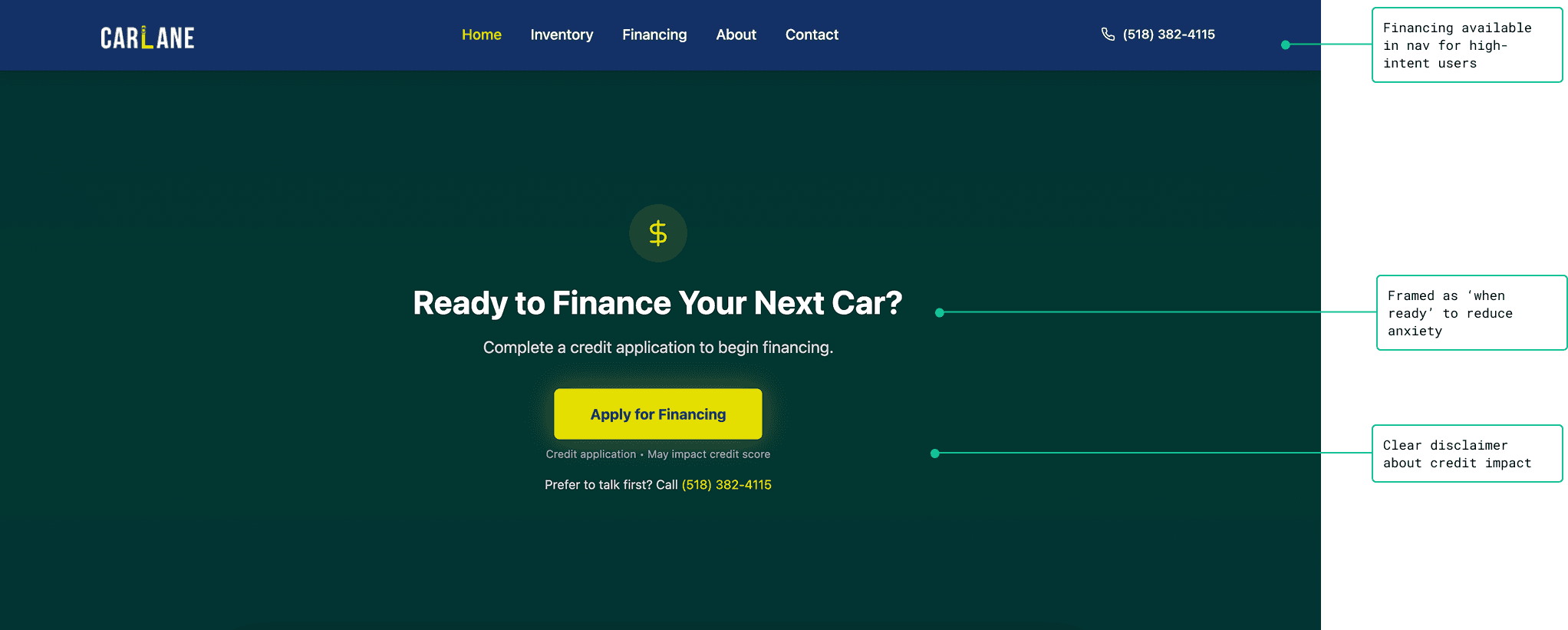
Financing is accessible without being forced as the first step.
System + Consistency
To keep the experience consistent across pages, I created a lightweight component system:
Scalable Architecture: Built a lightweight component system in Figma to ensure future inventory scales without breaking the layout.
State-Aware Design: Defined explicit UI states (Loading/Empty/Error) to prevent user frustration during data-heavy inventory searches.
Feasibility-First: Spacing and type scales were mapped to code-friendly logic, ensuring a 1:1 match between design and the Base44 build.
Outcome
This was a design and strategy engagement — analytics tracking and post-launch measurement were outside scope. The validation plan below defines exactly how I'd measure success if given access.
Validation plan (how I'd prove it works)
Browse intent
Home → Inventory CTR (Browse clicks)
Search usage / filter interactions
Inventory views per session
Shopping intent
Inventory → VDP CTR
VDP views per session
Lead intent
Test Drive CTA clicks
Test Drive form completion rate
Click-to-call interactions (mobile)
Financing intent
Financing clicks (nav + section)
Credit app completion rate
Next test:
A/B test the homepage secondary CTA: Schedule Test Drive vs Get Prequalified and compare lead quality + conversion.
